Fun
PhD Flight log
Loading..
Friends of Donghoon
Research is a team sport, and I've been lucky to have an all-star team of friends and collaborators inspiring me along the way (some are now senior enough that "friend" feels too casual, but you get the idea).
From SNU to UW, my work has been always built on their support, and I wanted to give a few special shout-outs:
-
Jaewook Lee (PhD student @ UW)
-
Youjin Hwang (Researcher @ Samsung)
-
Soomin Kim (Researcher @ Samsung)
-
Gloria Guo (Masters student @ UW)
-
Daniel Lee (PM @ Salesforce)
-
Lucas Colusso (Designer @ Microsoft AI)
-
Alex Chen (Masters student @ UW)
-
Alice Gao (PhD student @ UW)
-
Rock Pang (PhD student @ UW)
-
Jason Wu (Asst. Prof @ Purdue)
-
Tonya Nguyen (PhD student @ UC Berkeley)
-
Changhoon Oh (Assoc. prof @ Yonsei)
-
Katelyn Morrison (PhD student @ CMU)
Why monochrome?
Some of you may have noticed that my entire website, and most of my design work, is in grayscale. This isn't just a coincidence; even my wardrobe is surprisingly monochrome. It's intentional.
That's because, one lesson I learned early on as an amateur designer is -- unless you're a genius with color, it's often better not to use it at all. Then my question gets:
Am I skilled enough to impress my audience solely with color? Probably not.
Am I skilled enough to ensure my design won't introduce any additional redundancies? Probably yes.
This is likely true for most people, and it can even reduce the time spent considering too many design factors -- especially for those with agile workflows, like system HCI researchers like myself. If that's the case, trust me -- simply keeping your design monochrome, ideally in black and white, can significantly improve its mood.
Grayscale designs often achieve the same or better level of visual appeal as well-colored ones, with significantly less time and effort.
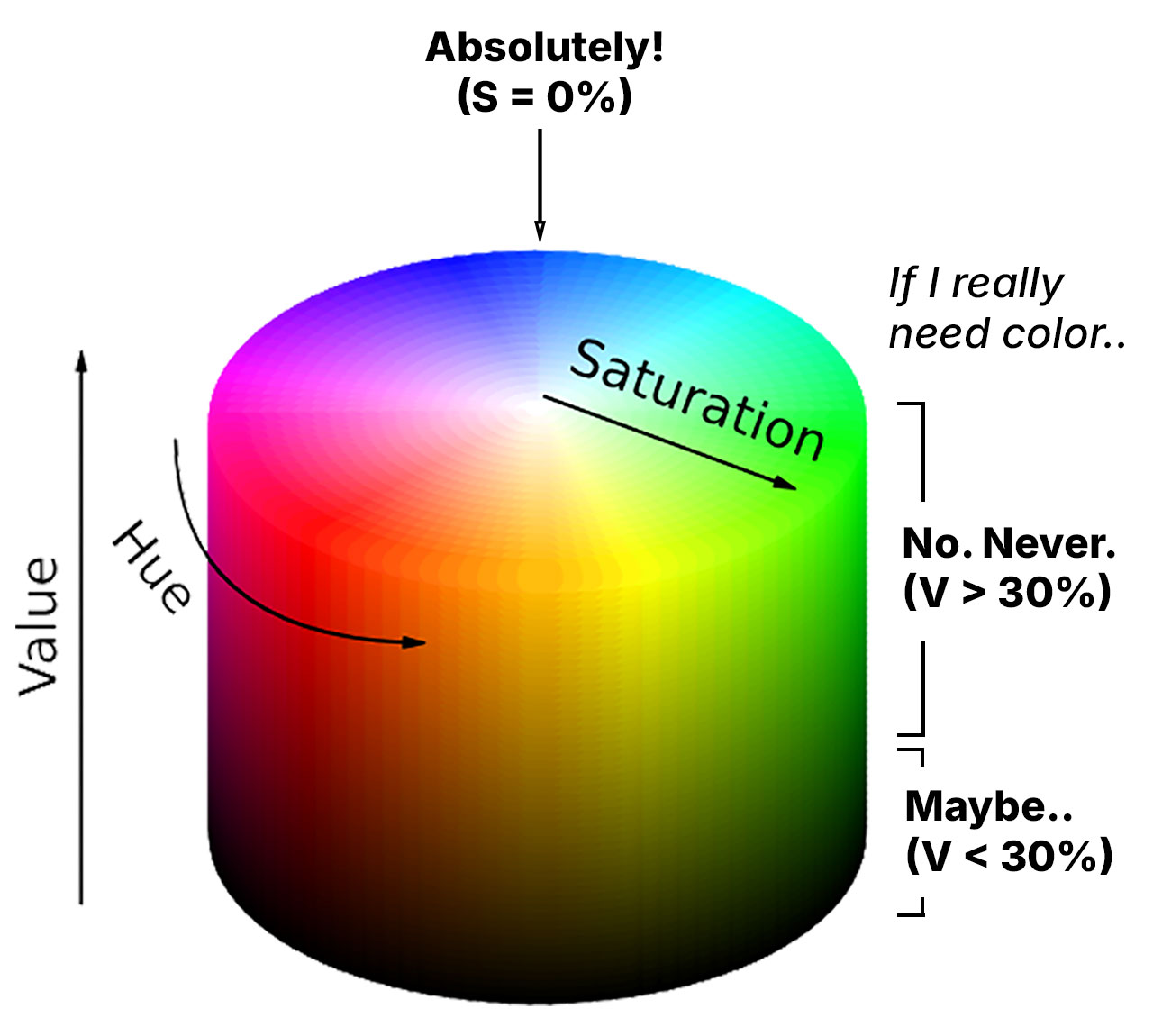
But what if you have to use color -- say, your branding requires it? In those cases, I usually limit the value (in HSV terms) to below 30%. In other words, I keep the colors as dark as possible. That way, I can stay true to the branding without sacrificing the sleek, minimal style.
Still, I would try my best to stick with a fully grayscaled style; technically, that means setting saturation to 0% in HSV. This way, the focus stays on the content itself, not on potentially questionable color choices.
Donghoon's mental model